I've been working on a lot of web forms over the past few months. Everything from single-input email signups to registration forms with dozens of inputs. The main priority, of course, is providing a great user experience.
Top-of-the-line inputs###
HTML forms have come a long way in the recent years with the addition of input types, required and placeholder attributes, and more flexibility with styling.
I used a mixture of the above on the forms I recently built, assuming the placeholders and client-side validation would help users complete the forms quickly and painlessly.
Each input was given an appropriate input type to make entering data quick and easy. The required attribute was added to utilize client-side validation. And all text-y inputs used a placeholder attribute to keep the UI clean while providing info on what to enter.
But in testing...###
User testing quickly revealed the forms to be not-so-straightforward. The required attribute worked well in only a handful of browsers, necessitating Javascript fixes (polyfills) to fill the holes. And even with the polyfills there was room for improvement.
Several input types behaved inconsistently, with some browsers handling them well, others confusingly. For example - datetime inputs aren't supported in all browsers, making it difficult for users to format their info correctly.
Most surprising however were placeholders - those subtle text hints you sometimes see inside inputs telling you what info to enter.

In our testing users found them confusing, sometimes deleting the content they added to re-view the placeholder and remind themselves what info to enter. Several UX studies backed up this discovery.
Less concerning but still important, the placeholders worked inconsistently across browsers. In some the placeholder would disappear as soon as the input element gained :focus. On others, the placeholder would disappear only once content was entered.
Designing a better input###
Faced with these pitfalls I devoted a few hours to building a better input/placeholder element. My goals for a better input experience:
- The input should clearly indicate the input needs to be completed
- The input should clearly indicate what info is being requested
- The input should clearly indicate what info is being requested while info is being entered
- The input should clearly indicate when the input has been completed correctly
- The input should work with a majority of
texttypes and client-side validation - The design of the input should be clean and uncluttered
- The input should work on all major, modern browsers
- The solution should be CSS-only
Research###
I started by researching existing solutions. The best I found (or closest to what I was imagining) was a solution by Jeremy Gillick in his great post on CSS-Only Placeholder Field Labels.
It contained several features I was looking for, namely the ability for placeholders to be visible while entering content.
The missing component was validation. As info is being entered, the input should indicate when it's been correctly completed. Additionally, each input should indicate if it needs attention if it's not correctly completed.
Solution###
My final solution uses a combination of <label> elements with placeholder attributes, coupled with the :valid and :invalid psuedo-classes to create smart inputs with several states. The solution is 100% CSS-based and works on all major, modern browsers.
or try the real thing...
To fulfill the goals defined above I created inputs with 4 distinct states.
Input States#####
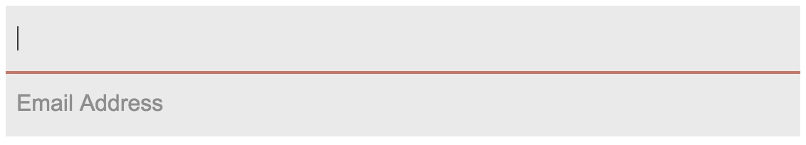
No focus, invalid (initial state)
The input is shown with the placeholder. The label is hidden with the exception of one border (the dark underline on the input), inspired by standard print form fields.

Focus, invalid
The placeholder is hidden and the label is shown beneath the input so the user can view the instructions while typing. The input has a red underline to indicate the input is invalid.
Focus, valid
Same as #2 except the underline changes to green.

No focus, valid (completed)
The <label> is hidden, leaving a plain input with an icon to show it's valid.

The HTML###
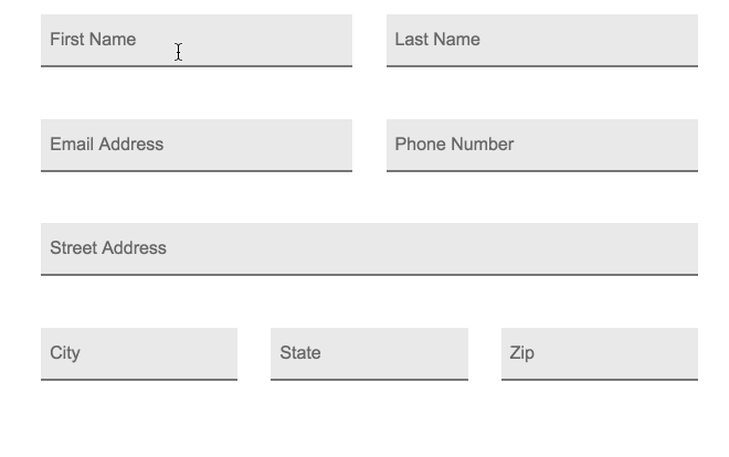
The HTML structure for each element is relatively simple - a div container with an <input> and <label>:
<div class="input-container">
  <input type="text" placeholder="First Name" required>
  <label>First Name</label>
</div>
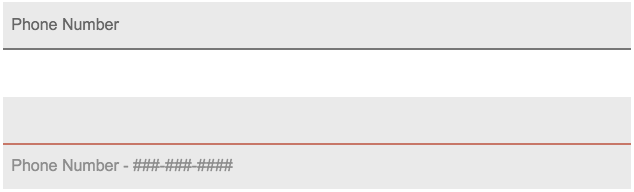
The reason I'm using both a <label> and placeholder is to allow for different content to be displayed after the input gains focus. For example, the following HTML will create an input displaying Phone Number initially, and Phone Number - ###-###-#### once the input gains focus.
HTML
<div class="input-container">
  <input type="tel" placeholder="Phone Number" required>
  <label>Phone Number - ###-###-####</label>
</div>
Result
The CSS###
The bulk of the work is accomplished using the :focus, :valid and :invalid pseudo-classes. The combination of these allows the input style to change based on state.
Key Selectors#####
The 4 selectors used to create these states:
/* Default styling for the label */
input {}

/* Label style when input is valid */
input:valid {}

/* Label style when input has focus and invalid */
input:focus:invalid {}

/* Label style when input has focus and valid */
input:focus:valid {}
The :valid pseudo-class is applied when the combination of the input type, pattern, min, max and other input settings become valid. Once an input value passes the validity test it acquires the :valid pseudo-class and can be targeted using input:valid.
Note: any input type, required, pattern, min, max and other validity parameters should work with this setup.
Browser Compatibility###
Somewhat surprisingly, the :valid (and :invalid) pseudo-classes work amazingly well, and even more surprisingly, consistently. In fact, with the exception of IE9 and below, the selectors work across the board.
While some browsers have partial support for form validation, all modern browsers support the pseudo-classes. In other words, some browsers, like Safari, will allow a form to be submitted despite having invalid required inputs, but those browsers will still apply the :valid and :invalid pseudo-classes.
Every modern browser I've tested to date has worked. Chrome, Firefox and Safari on OSX. Chrome on Android. Safari on iOS. IE 10/11 on Windows. Edge 12 on Windows. Even IE 9 handles the inputs with reasonable consistency, though without the valid state.
Caveats###
The inputs states are 100% CSS-based. For support below IE10 a Javascript polyfill would be required. Javascript validation is recommended for validating inputs before submitting too.
Summary###
I was completely unaware of the options presented by the :valid and :invalid pseudo-classes prior to this experiment. They're consistency between OSs and browsers make them a great way add helpful UI features to improve the UX on your forms.
Comments