The other day I opened CNN.com and was immediately greeted with the following loading animation.

That's the actual animation, not a low-res screen grab. Two visuals immediately caught my eye:
- Jagged, pixelated edges
- Abysmal, low frame rate
I opened Chrome's Dev Tools to inspect the element. Turns out the loading icon is nothing more than a low-quality animated GIF, coming in at ~2kb. As a CSS-fan I know there are more-performant, better-looking solutions to this GIF. So I set out to build an alternative.
Turns Out, It's Really Simple
Here's what we'll be building:
We'll start with the HTML structure - a simple nested <div>:
<div class="cnn-loader-stage" role="progressbar" aria-busy="true">
  <div class="cnn-loader"></div>
</div>
Now for the CSS. First, the outer .cnn-loader-stage element:
.cnn-loader-stage {
  position: relative;

  perspective: 100px;
  transform-style: preserve-3d;
}
The important styles here are the 3D properties - perspective to produce the 3D depth effect as the animation rotates, and transform-style: preserve-3d to indicate the children of the element should be positioned in the 3D-space.
By itself the .cnn-loader-stage produces nothing to see. So let's take a look at the inner .cnn-loader element:
.cnn-loader {
  width: 50px;
  height: 50px;
  background-color: #cc0000;
  border: 1px solid #aa0000;

  position: relative;

  backface-visibility: visible;

  animation-name: rotateFlip;
  animation-duration: 1.4s;
  animation-iteration-count: infinite;
  animation-timing-function: linear;
}
The width and height of 50px are merely to match the size of the animated GIF, and can be changed.
The background-color and border are the entirety of the styling - a CNN-red with a slightly darker 1px border.
Then comes the important stuff...
First, backface-visibility so the back of the element is visible when the element is turned around. This isn't really necessary (and could be removed here) but I like to be explicit.
Then the animation properties:
animation-name: rotateFlip- to define the animation keyframesanimation-duration: 1.4s- to match the existing animated GIFanimation-iteration-count: infinite- to make the animation repeat over-and-over-and-overanimation-timing-function: linear- to match the animated GIFs transitions
And finally we have the rotateFlip animation keyframes:
@keyframes rotateFlip {
  0% {
    transform: rotateY(0deg) rotateX(0deg);
  }

  55% {
    transform: rotateY(180deg) rotateX(0deg);
  }

  100% {
    transform: rotateY(180deg) rotateX(180deg);
  }
}
This produces two rotations, one after the other. First, the square is rotated along the Y axis, followed by the square being rotated along the X axis - this produces the effect of flipping the square from left-to-right, then flipping the square top-to-bottom. This animation then repeat infinitely.
Cross-Browser Compatibility
For the sake of brevity I've removed browser prefixes from the above code samples. The demo below adds all the necessary browser prefixes to make the loader work in all modern browsers.
File Size
Even with browser prefixes the entire CSS and HTML for the loader comes in at under 1.2kb, or barely over half the size of the animated GIF. As an added bonus our CSS solution doesn't require an additional HTTP request, unlike the animated GIF.
Performance
Using Chrome Dev Tool's Performance Monitor I recorded 10 seconds of activity and rarely did the animation fall below the target of 60fps.

The Frames Per Second Meter showed a similar rate.
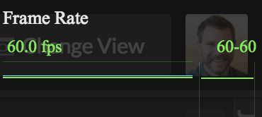
The 60fps mean the animation appears smooth, providing a great user experience while waiting for content to load.
Comparison
Here's the final CSS solution (left) with the existing animated GIF (right).
See the Pen CNN Loading Animation (compared to existing animated GIF) by Brett DeWoody (@brettdewoody) on CodePen.
Comments